

Overview
The project aimed to design an analytics dashboard for S&C Electric’s Design System to monitor the usage of components, with a focus on both the design and development sides. Despite limited data, I worked with the team to find alternative data sources and created a dashboard that enabled the team to make informed decisions about component development and prioritization.
Duration
7 days (within a design sprint)
Tools
Figma
Miro
Bitbucket
Product Status
✅ Shipped
Role
End-to-End UI/UX Design
User Research
Project Program
Team
S&C Electric Design System Team
Problem Statement
How might we monitor the success/health of S&C Design System with limited data?
Solution
A Dashboard that presents all the data in a digestible way and utilizes alternative data sources for easier manual checks.
Final Design Overview

DS Analytics Dashboard Overview
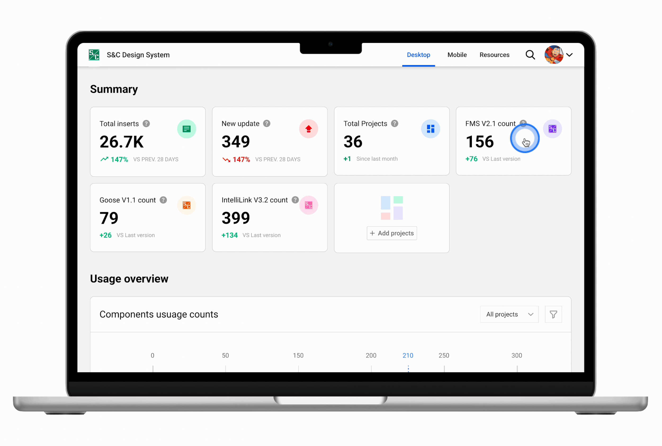
Usage Breakdown By Product

Usage Breakdown By Component
How it started
I was tasked to design the Analytics Dashboard with little context within a two-week sprint
During my final two-week sprint at S&C, my manager assigned me the task of designing the analytics dashboard for the design system. This was one of three tickets that I was responsible for, and I was given very little context to work with. The requirements document was blank, and I only had two references: the Figma analytics and a code snippet that outlined the available data. With a strict deadline of two weeks to complete all three tickets, time was a significant constraint.

Figuring out the why
Why S&C need an analytics dashboard for their design system
The team lacked a tool to monitor the usage of components within the S&C design system, which hindered our ability to make informed decisions about component development and prioritization. Although analytics for component adoption was available in Figma, it only focused on the design side, and the team also wanted to see how things worked from the development side. There are also components that were implemented during the team's use of Sketch, prior to transferring to Figma.
Business goals & use cases
The ideal business needs & goals
By talking to the management team, I was able to find out the business goals for the dashboard:
Find out which components are popular
Identify often detached components
See how collaborators are using variants
Identify under-used components
Compare adoption between two libraries
See which teams are using each library
Find examples of components so you can see how they're used and supplement documentation
The use cases

Limited data
Limited data to support the business goals and use cases
After gaining a better understanding of the business objectives, I began to explore the available data that could support these goals. To get a more comprehensive understanding of the data, I scheduled a meeting with the engineering team and requested that they guide me through the raw data available. Unfortunately, the outcome of the meeting was not as promising as I had hoped. The team informed me that the sample raw data was the only available data and presented me with an example of what it looked like. (It's worth noting that I am not a developer, and the following sample data is based on my recollection, so it may not be entirely accurate.)

How the raw data looked like in my memory
Searching for alternative data sources
To make the dashboard feasible, I had to work closely with the developers to extract as much data as possible or find alternative data sources. I asked questions such as, "Do we have data on component usage counts?" and "How can I track the usage of components in our products? Is there a link available for that?" The developers provided me with file locations for the data, but they were not linked. I inquired if the file locations were easy to access and was relieved to hear that they were. This collaborative process enabled me to collect the necessary data to create the dashboard.

Use cases and the newly found data sources
By having conversations like this, we are able to figure out how to use different data sources to achieve the three use cases.

Prototype
Design explorations
I examined various approaches to integrating all three use cases into a single dashboard and generated three distinct designs. Each design has its advantages and disadvantages. After collaborating with the team and receiving their input, we determined that V3 is the optimal choice for our use cases. V3 is user-friendly, as all information is readily available on the summary cards on a single page. While it utilizes more modals, which could potentially constrain content display, this is not a significant concern since each modal won't require a substantial amount of information to be displayed.
Wireframes and user flows

The impact
The analytics dashboard for S&C's design system helped to increase component adoption by 17%, and decrease component detachment by 13%.

Reflection
In reflecting on my approach to designing the dashboard for S&C's design system, I believe that my initial research and communication with stakeholders was effective in understanding the project's needs and constraints. However, given the limited data available, I recognize the need to explore alternative data sources and methods for collecting data to provide a more comprehensive view of component usage. Additionally, conducting further stakeholder research to understand the needs and priorities of different teams and individuals within the company would have been beneficial.
If given more time and data, I would prioritize conducting additional user research to gain deeper insights into how different teams are using the design system and what specific pain points they experience. This would enable me to design a more targeted and effective dashboard that meets the needs of all stakeholders. I would also explore alternative data sources, such as usage metrics from other design tools, to provide a more comprehensive view of component usage. Finally, I would prioritize the development of features that provide the most value to stakeholders, such as the ability to see how every component is used across different projects, and continue to iterate and improve the dashboard based on user feedback.